context
Fanfiction Novel Concept
This project was an academic concept built around the publisher Pelican Press* seeking a cover design for an original fanfiction novel. Whispers in the Woods: A Tale of Ink & Blood* is an original dark fantasy romance concept based on the world of Rachel Gillig’s One Dark Window and its gothic fantasy atmosphere.
*This is a fictional publisher and novel concept used for academic purposes.
Role
Research, Copywriting, Print Design
Timeline
Mar-May 2025
Tools
InDesign, Photoshop
Brief
Typography-Led Dust Jacket
The central requirement for this project was that typography serve as the primary design driver. The cover design needed to communicate the book’s dark fantasy genre and mood convincingly enough to function as a real commercial artifact, one that would appeal to adult women in their twenties and thirties who read dark fantasy, gothic romance, or romantasy.
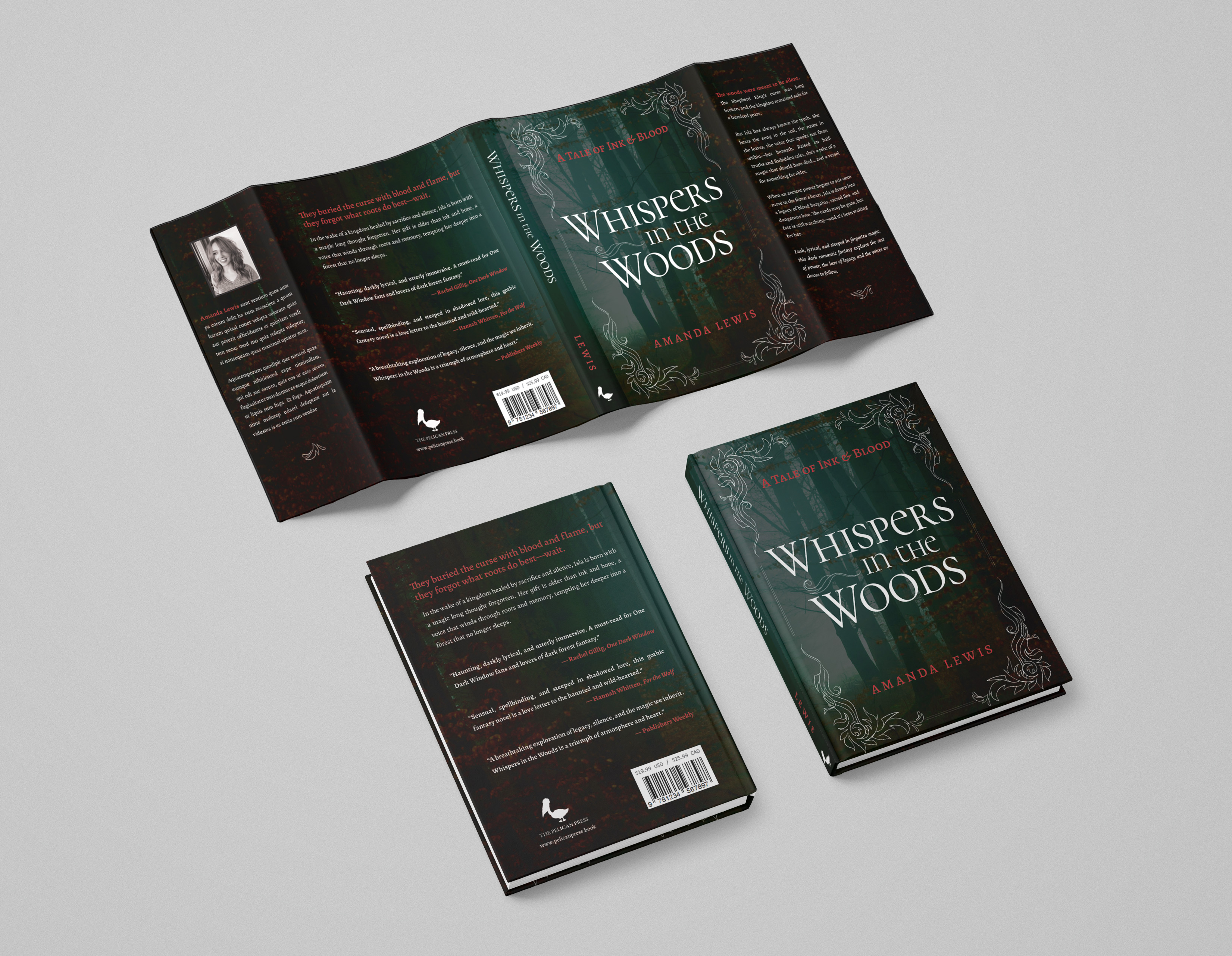
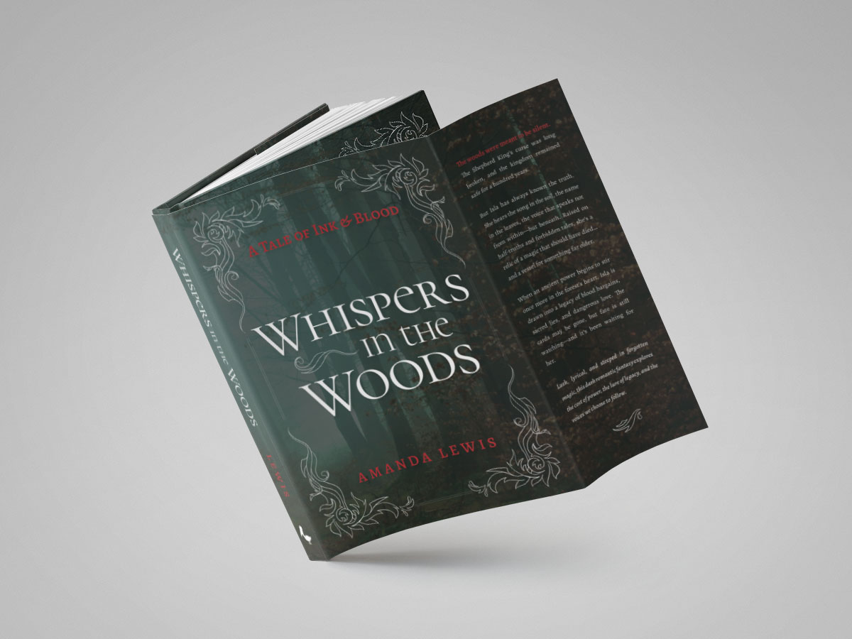
The deliverable was a full, print-ready dust jacket: front cover, back cover, spine, and front and back flaps, built to the publisher’s specified dimensions.
Guiding question
What catches a reader’s eye while still feeling familiar enough that they know what to expect?
Process
Defining Direction
Readers judge a book by its cover before ever picking it up.
Genre conventions help them anticipate what feeling to expect from a story. To ensure potential readers understand its message at a glance, I first needed to research industry standards for books similar to Whispers in the Woods.
Genre Research
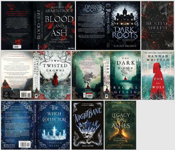
To learn about industry publishing standards and what readers expect from similar novels, I studied book covers in the dark fantasy and gothic romance genres. Popular titles like One Dark Window and For the Wolf helped identify common elements that target readers look for as they browse bookshelves.
Patterns identified include dark, moody palettes, text set in elegant typeface with subtle serifs, high contrast colors between type and background, and haunting or gothic motifs such as faceless figures, shrouded castles, fallen leaves, or barren trees.
guiding principles
The research showed that readers of this genre expect established conventions, but the design also had to add enough intrigue to stand apart from competitors. To do this, I prioritized the following:
1 moody contrast
Foreground & background should contrast in color while adding to a dark, haunting atmosphere
2 elegant legibility
Chosen typefaces should be legible and readable with an elegant, high-fantasy style
3 Fairytale vibe
The design should lean into an old storybook, or twisted-fairytale aesthetic within dark fantasy
Typography Direction
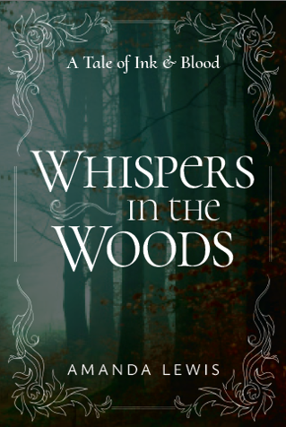
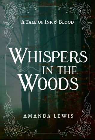
The first mockups I made developed two typographic directions for the front cover.
Direction 1 pairs a large, delicate Cormorant Unicase title with a light, widely tracked Ysabeau Office for the author name. Elegance sits in the display type while the supporting text stays quiet and easy to read. Overall, they add a delicate, romantic feeling to the dark cover.
Direction 2 pairs a flared, calligraphic Modern Antiqua title with Alegreya for the subtitle and author name, giving the cover a classic storybook tone. The heavier weight of this combination feels more traditional and nostalgic in style, like a historical romance.
In the end, I mixed the best of both options.
Design Decisions
Speaking the Genre’s Language
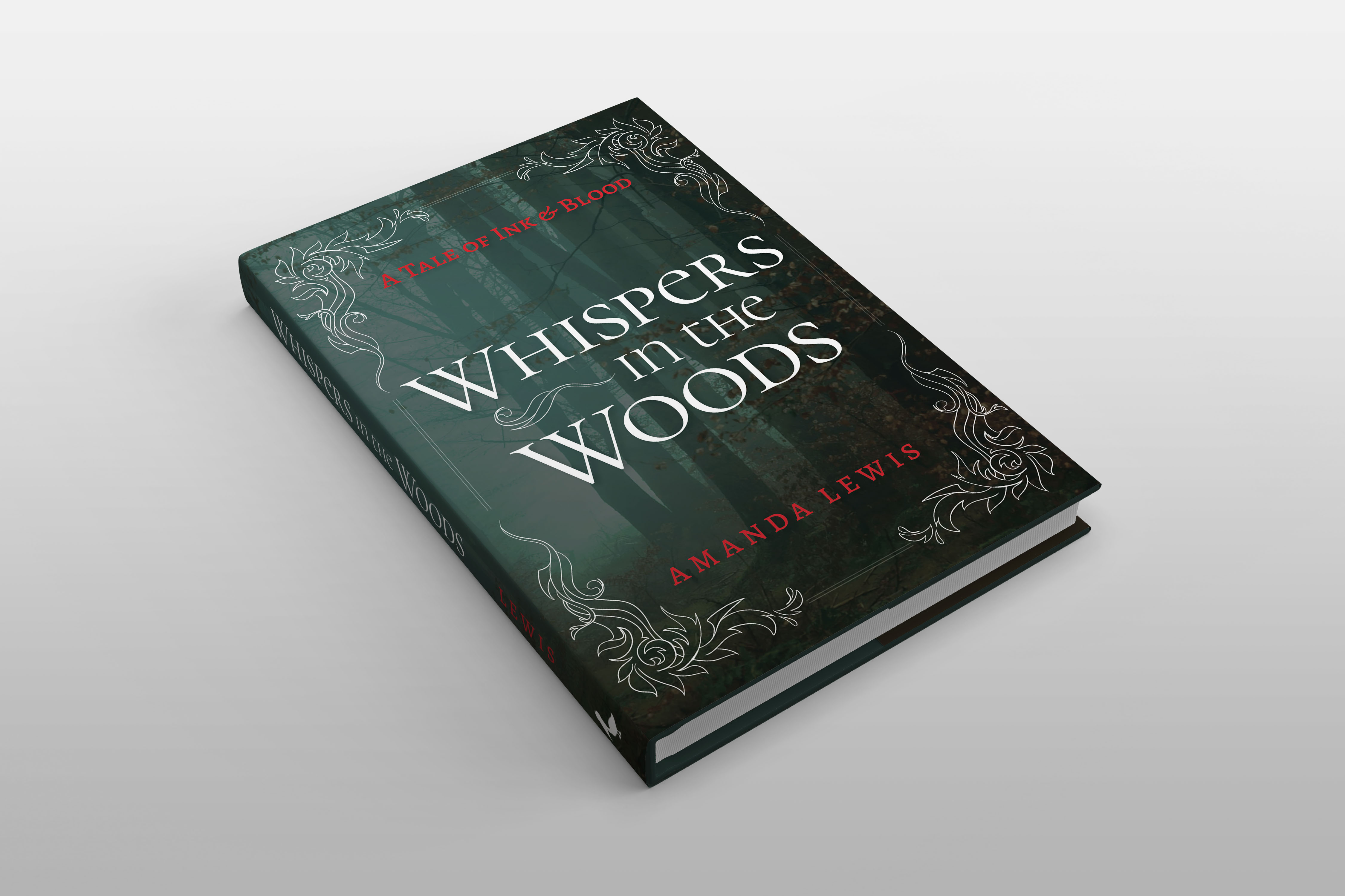
The design starts from the conventions readers of dark fantasy and gothic romance already know: atmospheric photography paired with elegant serif type that contrasts strongly against the background. The goal was a cover that signals that familiarity clearly while still standing apart on a shelf.
Typography
Focusing on genre-relevant fonts that lean into the elegant fantasy vibe, I combined the display elegance of Cormorant Unicase with the bookish and readable Alegreya for the final design.
Cormorant’s Garamond-derived letterforms offer the refinement the dark romantasy genre expects, and its unicase construction adds a distinctive quality without costing legibility. Alegreya was designed for literature and sustained reading, so it keeps the dense copy on the back cover and flaps readable.
The two typefaces share a classical serif foundation but have clearly separate roles, which keeps the pairing cohesive without becoming monotonous.
Imagery & Color
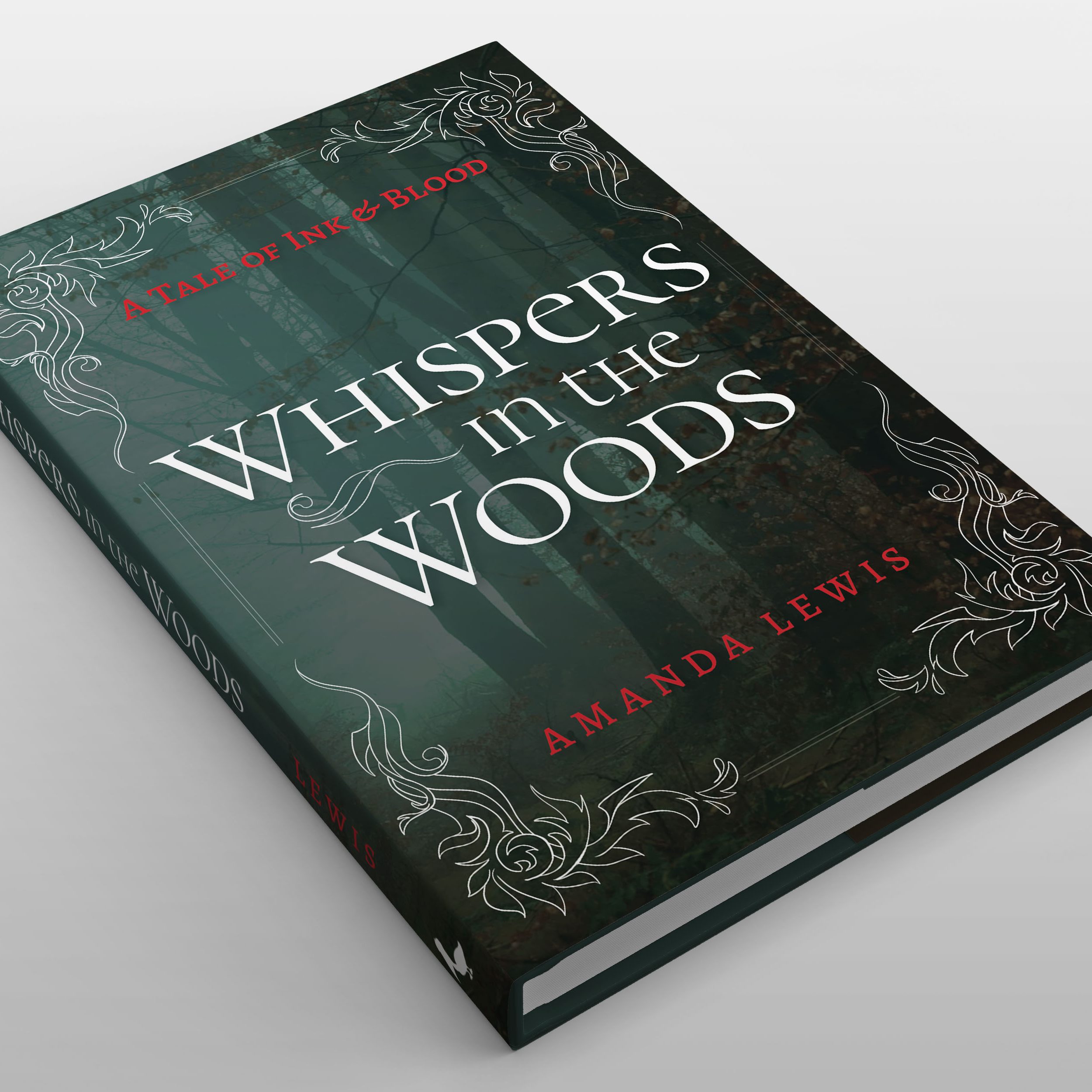
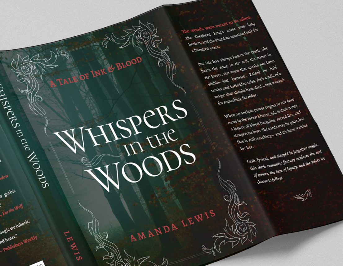
Imagery and color were chosen to support the type. Deep, misty forest photography establishes mood immediately, while white type against that background keeps the text readable. Blood-red accents on the subtitle, author name, and tagline introduce tension, giving potential readers a reason to read on.
Adding to the twisted fairytale vibe, I drew a set of filigree embellishments by hand to frame the front cover and accent the flaps. They reinforce the desired tone and add a level of craft that stock ornaments lack.
Layout
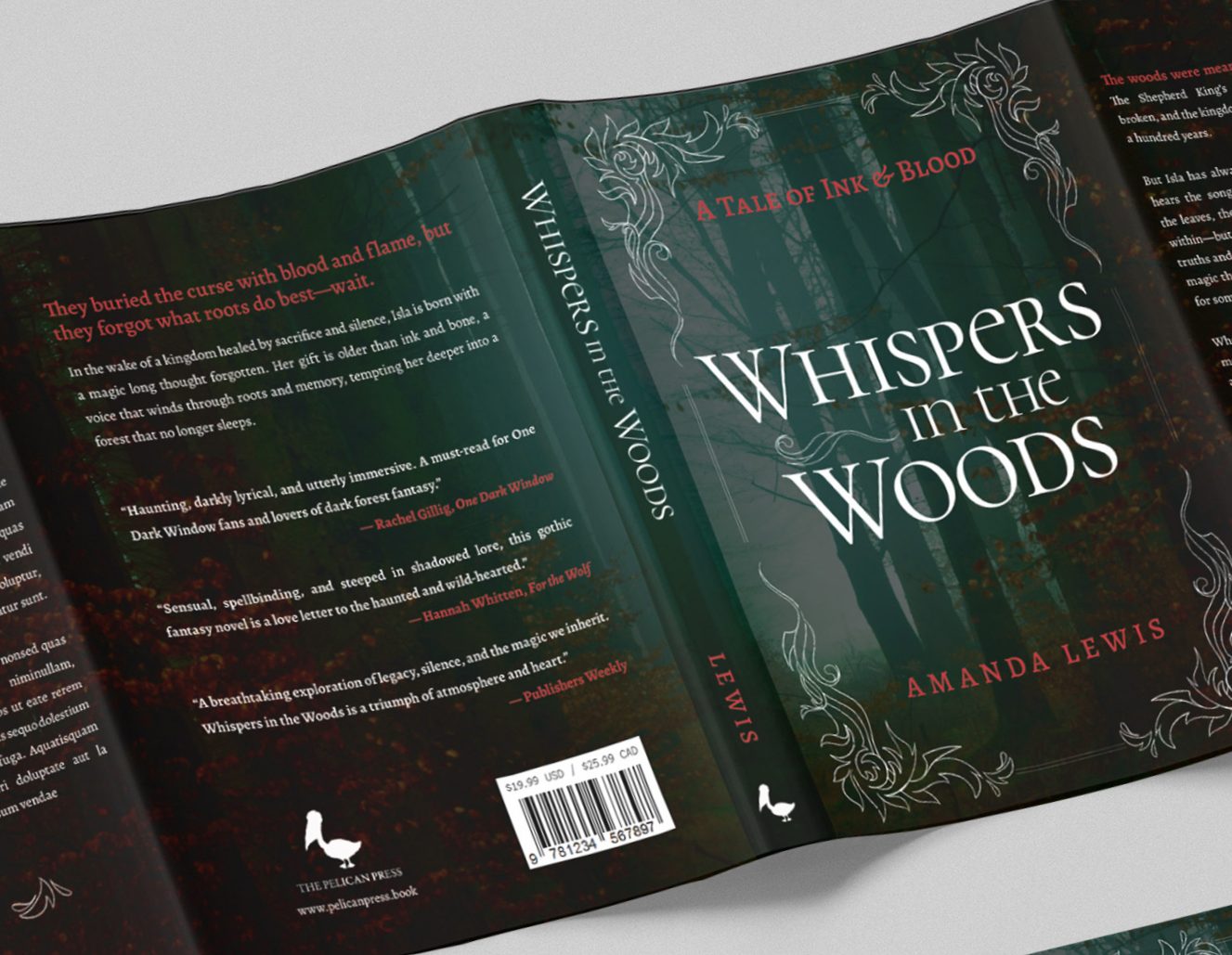
The cover’s layout is built on a clear order of size. The title is the largest element on the front cover, and the subtitle and author name step down from that. The balance is symmetrical, with the title block on a central axis inside a mirrored filigree frame.
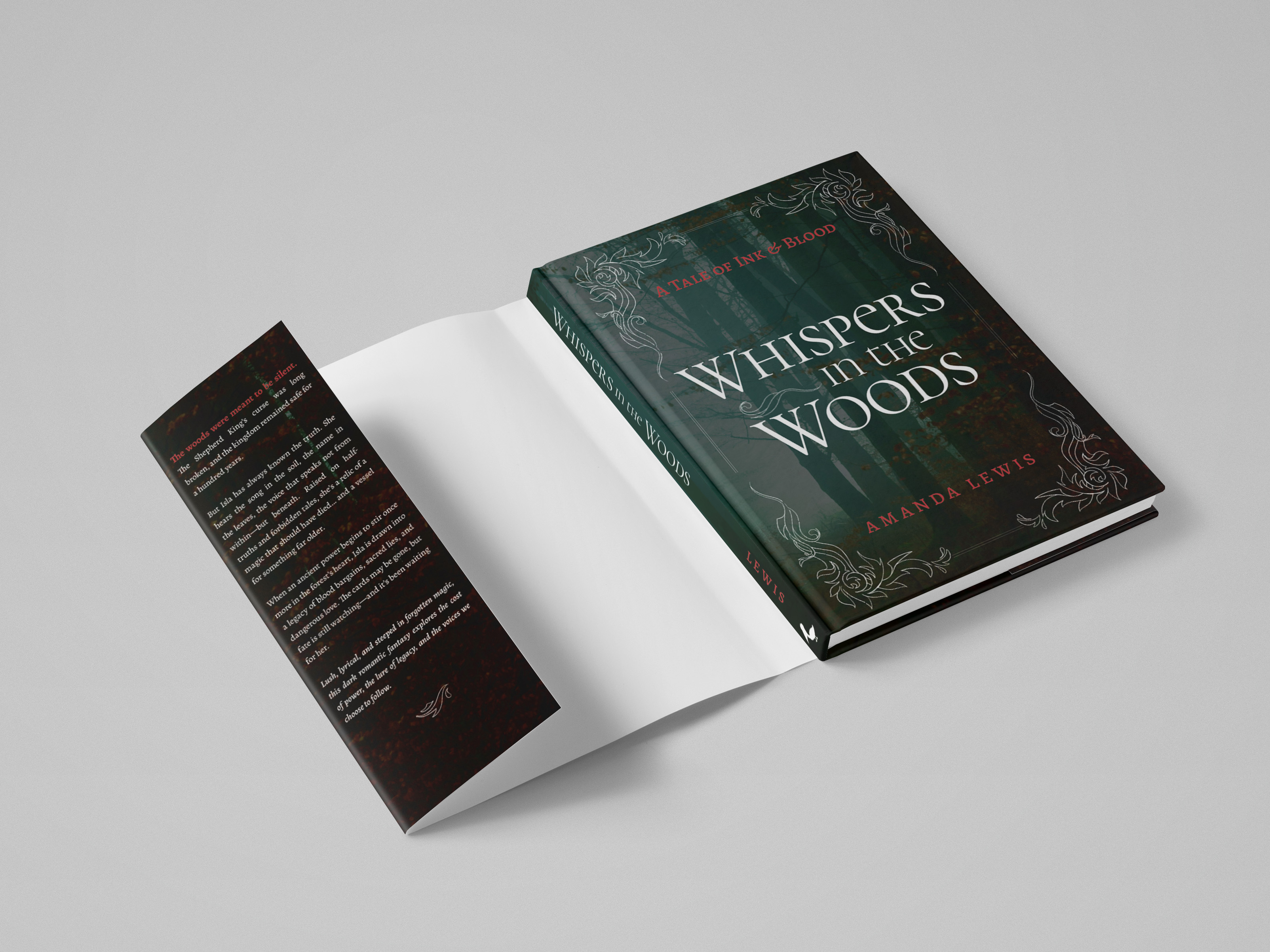
On the back cover, the tagline, blurb, endorsements, and publisher info follow a hierarchy that mirrors how a reader moves through a book’s packaging.
The typeface pairing, dark palette, and filigree set echo across the design, keeping the whole jacket cohesive.
final Design
Full Dust Jacket
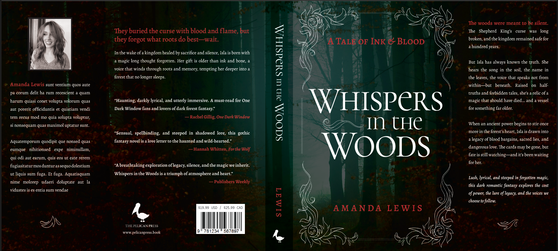
The jacket was built to the publisher’s specified size (20 x 9in) and includes every required component across its five panels. I wrote the jacket’s copy, including the tagline, summary, blurb, and fictional endorsements.
 View the full jacket!
For readers of dark fantasy, gothic romance, and romantasy, the jacket signals its genre at a glance with a dark, moody palette, forest photography, and elegant serif type in strong color contrast. For readers drawn to gothic fairytales and folklore, the hand-drawn filigree and storybook tone suggest exactly what they’re looking for.
What I learned
A cover has only a moment to make its case. This project showed how much of that first impression can come from color, custom details, and the way a design is presented.
using color to carry the message
Color can communicate tone before a single word is read, which helps carry the message to potential readers as they browse.
when nothing fits, draw it yourself
When no existing ornaments matched the tone I wanted, drawing my own helped capture the character I was after.
mockups strengthen presentation
A flat file can be hard to imagine in reality, so placing it on a 3D mockup gives viewers a clearer sense of it as a real product.