Overview
Professional Web Presence
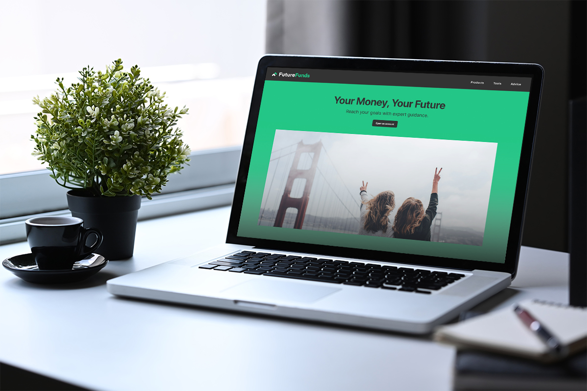
FutureFunds* Financial Planning is a financial services company whose mission is to guide young professionals toward financial independence and security through personalized planning tools and educational resources.
The FutureFunds company has decided to revamp their online presence to cater to a younger target audience via a new website landing page featuring tools that would aid in customers’ financial success.
*This is a fictional company used for academic purposes.
Objective
A Website that Converts Clients
The goal of this project was to design the FutureFunds website landing page to connect with their target audience, educate users about the company, and lead new visitors to become clients. It required the following features:
- List of services
- Savings goal calculator
- Appointment scheduler
- Recent blog posts
- Customer testimonials
Most importantly, the design needed to be responsive, adapting to user screen size and be usable across desktop and mobile devices.
Research
Insights that Inform
User personas, interview feedback, and competitor analyses were used to
better understand the target audience’s needs, expectations, and the
biggest challenges they faced when seeking financial planning services.
User Feedback
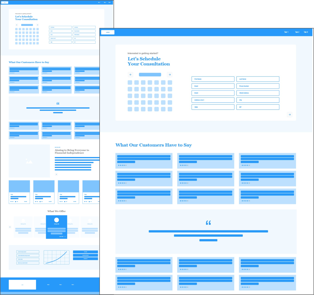
According to feedback provided, the initial design struggled to fill user needs and did not offer a clear, convincing pathway to conversion. Visitors were overwhelmed by the design’s cluttered content, inadequate spacing, and torrent of information all at once. They noted the design’s missing labels, lack of context, and inconsistency between similar elements. They were left confused, overwhelmed, and unable to move forward.
User Quote
“Most buttons lacked labels, and the similar arrow icons were confusing. I didn’t know what the buttons were meant for, which made the navigation confusing.”
Defining our Target Users
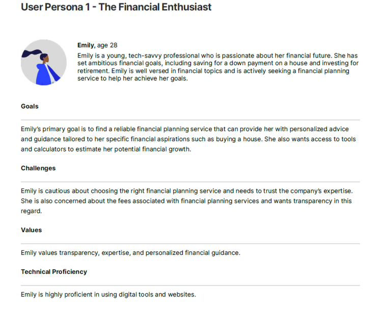
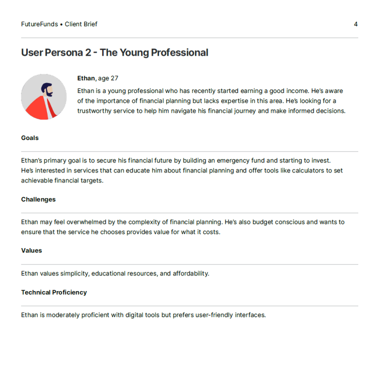
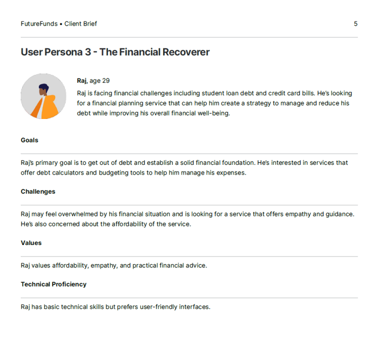
To ensure the design solution was grounded in the needs and challenges of FutureFunds customers, these user personas helped inform key insights into what people want from financial services sites.
- A professional looking site that users can trust
- Transparent about fees and value they provide
- Offers education and guidance to customers
From financially affluent to financially recovering, and from those well-versed to those needing more guidance, FutureFunds customers deserve a product that fits all their needs.
User expectations
When users visit a fintech website, they come with a set of
expectations, or mental models, that need to be considered.
1 trustworthy & credible website
Users need to trust the service in order to convert. This includes a professional looking website, security signifiers, & way to contact.
2 consistency & transparency
The design must be consistent so users know what to expect, and it must show the brand’s values aesthetically & contextually.
3 education/guidance with services
Customers have varying levels of financial literacy and seek guidance or education when looking for a service to rely on.
Competitor Analysis
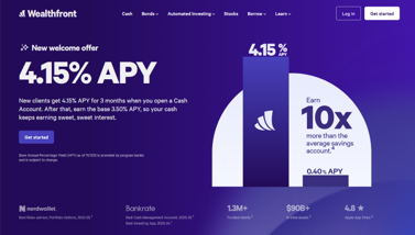
Competitor research was done on fintech companies with similar products and audiences. I aimed to analyze what made them trustworthy and paid special attention to content ordering, prominently featured tools, lead generation, and how UX principles were supported or ignored.
Expanding on each competitor’s design choices, I considered how they might affect visiting users, depending on their needs. These insights helped better inform FutureFunds’ landing page design.

Service Offerings
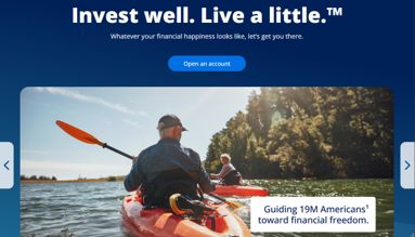
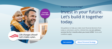
Hero and content sections prominently offered goal-oriented services or special offers. Headlines often centered emotional promises related to financial success, but some included explanation of services.
Financial calculator
Surprisingly, several competitors made their calculator tools difficult to find, either burying links in fine print or requiring search to locate. None of them featured such a tool on their home page.
Appt. Scheduler
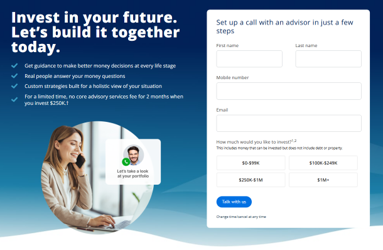
While no competitor featured an appt. scheduler on their home page, buttons and navigation labels made contact forms easy to find. Forms were multi-step, gradually disclosing fields.
Recent blog posts
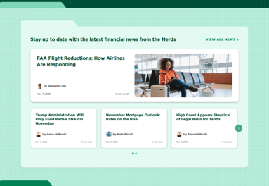
Few posts were on home pages; sections linked to separate index pages with more articles. The term “blog” was avoided, replaced by labels adjacent to financial literacy, such as “learn” or “currency”.
Key challenges
After reviewing the research and auditing the previous wireframe design, several challenges were most clear.
1. Building trust with new visitors
The initial design lead with an appointment scheduler before sharing what the company was about, demanding contact before user understanding.
To build trust, we need to provide proper context about the company before requesting action.
2. Meeting user expectations
The initial wireframe was inconsistent and cluttered, left users confused, and they were unable to decide what to do next.
The redesign needed make next steps clear, feel approachable to first-time visitors, and offer guidance to those who need it.
3. Adapting to smaller screens
To adapt to a modern audience, mobile use needed to be prioritized. The redesign needed to adapt to a user’s screen size. Content and interaction patterns would require different solutions to make the page usable, and content scannable, on a smaller mobile screen.
How Might We
How might we redesign the landing page to appeal to young professionals in a way that builds trust and leads them to become clients?
ideation
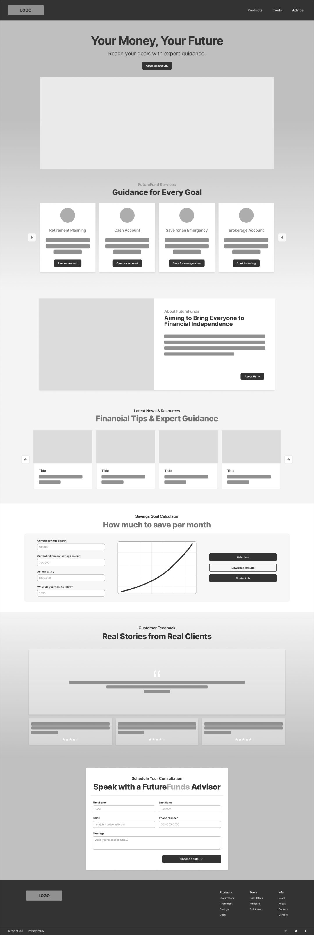
Drafting Wireframes
With a clearly defined user, and key challenges in mind, I explored solutions that would solve business goals and user needs alike.
guiding principles
It was clear from the research stage that the client required a responsive UI with specific features, while users desired a transparent and trustworthy design that offers clarity and guidance.
To solve for both, I prioritized the following:
1 context
Clarity would be key when providing context, through titles, labeling, descriptions, and more.
2 guidance
Guidance through content would lead users to next steps, working hand-in-hand with context.
3 accessibility
Accessibility needs to be prioritized to ensure an inclusive design, especially with mobile adaptations.
Addressing User Needs
One of the main goals with this redesign was to shift the user experience from feeling demanding to feeling informative and confidence-building. The goal was to give new visitors a clear path forward, and for them to empowered to make their own decisions.
Consistency & User Expectations
User expectations involve not just what they’re looking for when visiting a given website, but also what they expect when interacting with any given element. This redesign accounts for those expectations with an emphasis on consistency.
Colors, buttons, and card styles behave the same way throughout the landing page, which allows users to build expectations as they scroll. Interactive elements look and behave consistently, which reduces guesswork and makes navigation feel more predictable.
Content Sequencing
Content was rearranged to flow in a more intentional order that follows how users naturally evaluate a financial service. First by understanding the company, then exploring offerings, then interacting with tools, and finally, being prompted to take action. This way, site visitors are not forced to make decisions before they’re ready.
Providing context before conversion helps build trust

Design
Finalizing Mockups
Once the initial wireframes were developed and approved, I worked on fleshing out a more polished mockup.
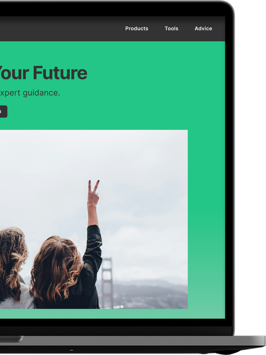
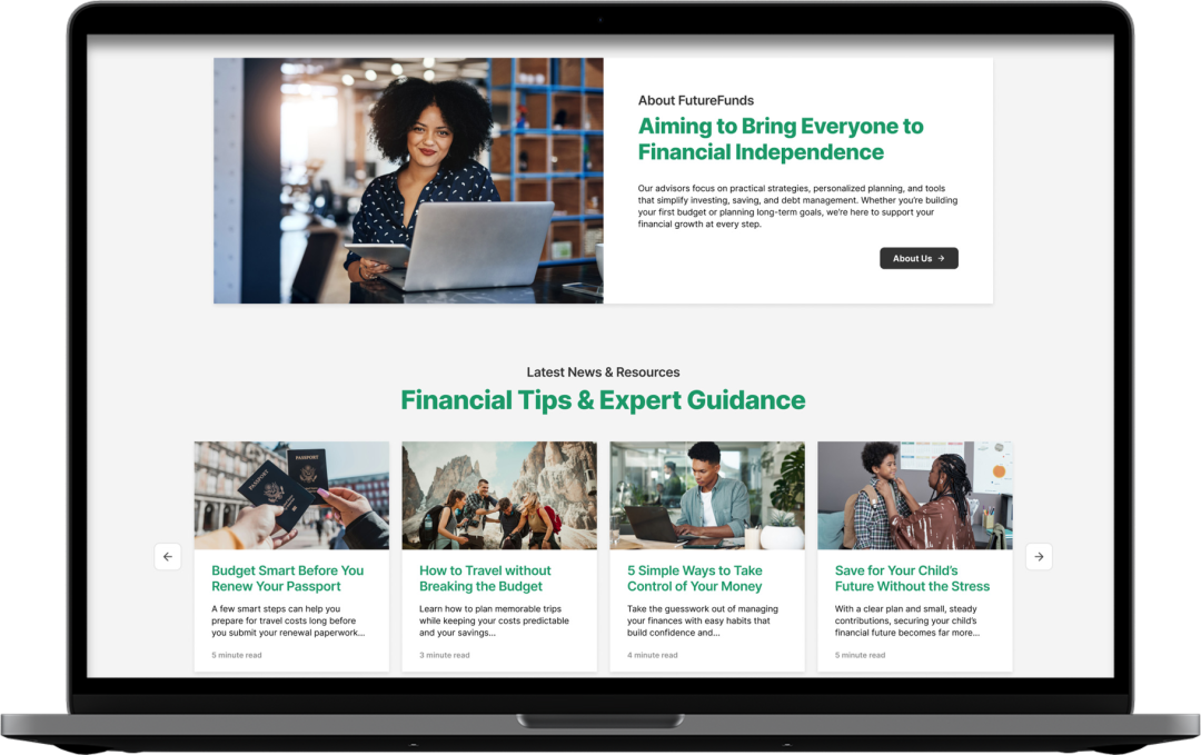
Realistic Copy & Images
Realistic copy and images were added to reflect what users expect across similar sites. Headlines were written to be goal-oriented, mixing in clear explanations and visions of future financial success. Images were selected as a reflection of that desired future, supporting what the headlines and copy promise.
Context Labeling
Clear, meaningful labels were added to buttons, titles, and navigation, to clarify what each section is about, where links lead, and what users can expect if they interact with different elements.
Icons are also paired with supporting labels so their context is immediately understandable.
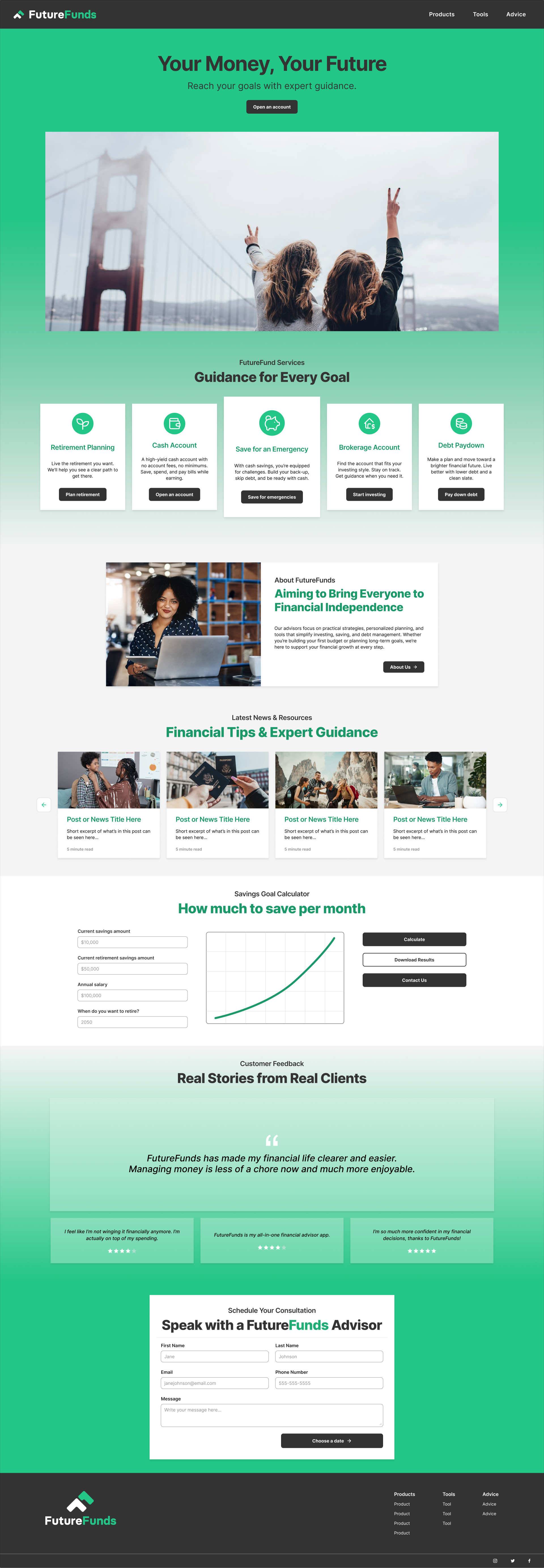
 Click to view!
Accessibility Considerations
Accessibility standards were key considerations with this redesign, especially considering earlier feedback where users felt unsure, overloaded, and hesitant to engage with the page.
- Content spacing, grouping, and proximity were adjusted deliberately to reduce clutter and add breathing room to the design.
- Headings and subheadings were adjusted in size and color for hierarchy and emphasis, while copy was shortened and kept legible, helping users easily scan the page.
- Strong color contrast was prioritized throughout the landing page, with special emphasis on buttons and interactive elements to grab user attention.
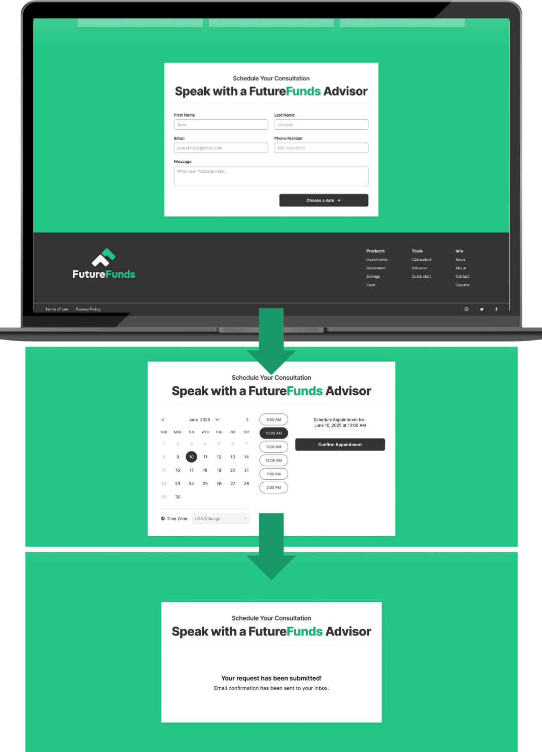
Multi-step Forms
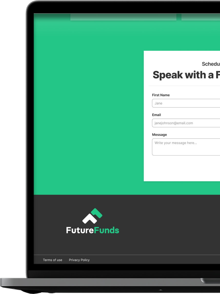
The appointment scheduler form was split into multiple steps, progressively disclosing requirements, so that users wouldn’t be overwhelmed all at once.
Visible labels were added to form fields so that context would not be lost after clicking an input field.
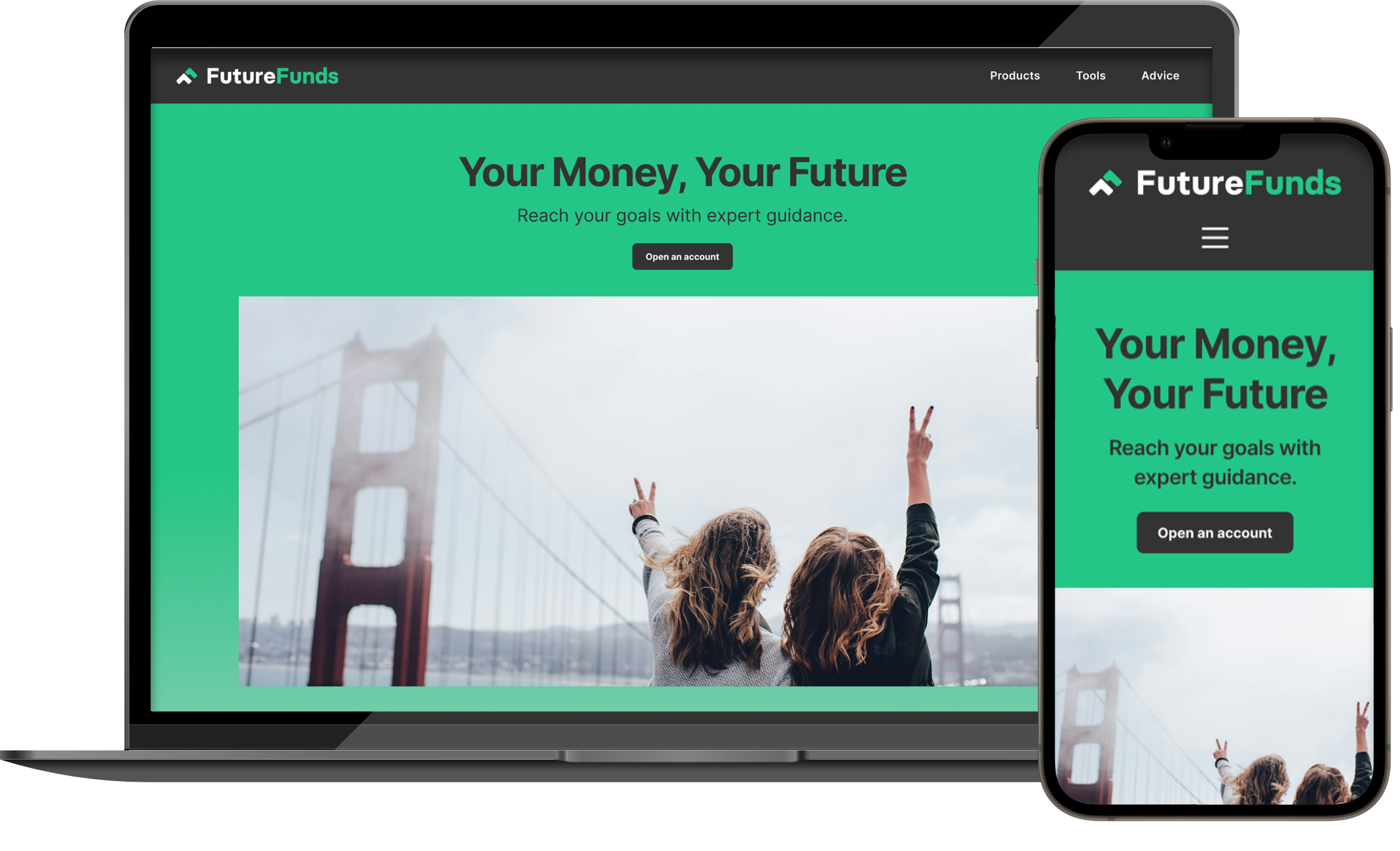
Mobile Screen Adaptations
The modern age makes adaptive responsiveness and mobile design
considerations a non-negotiable, especially considering FutureFunds’
audience of young, tech-savvy, busy professionals. A fintech website
needs to be able to function properly on both desktop and mobile.
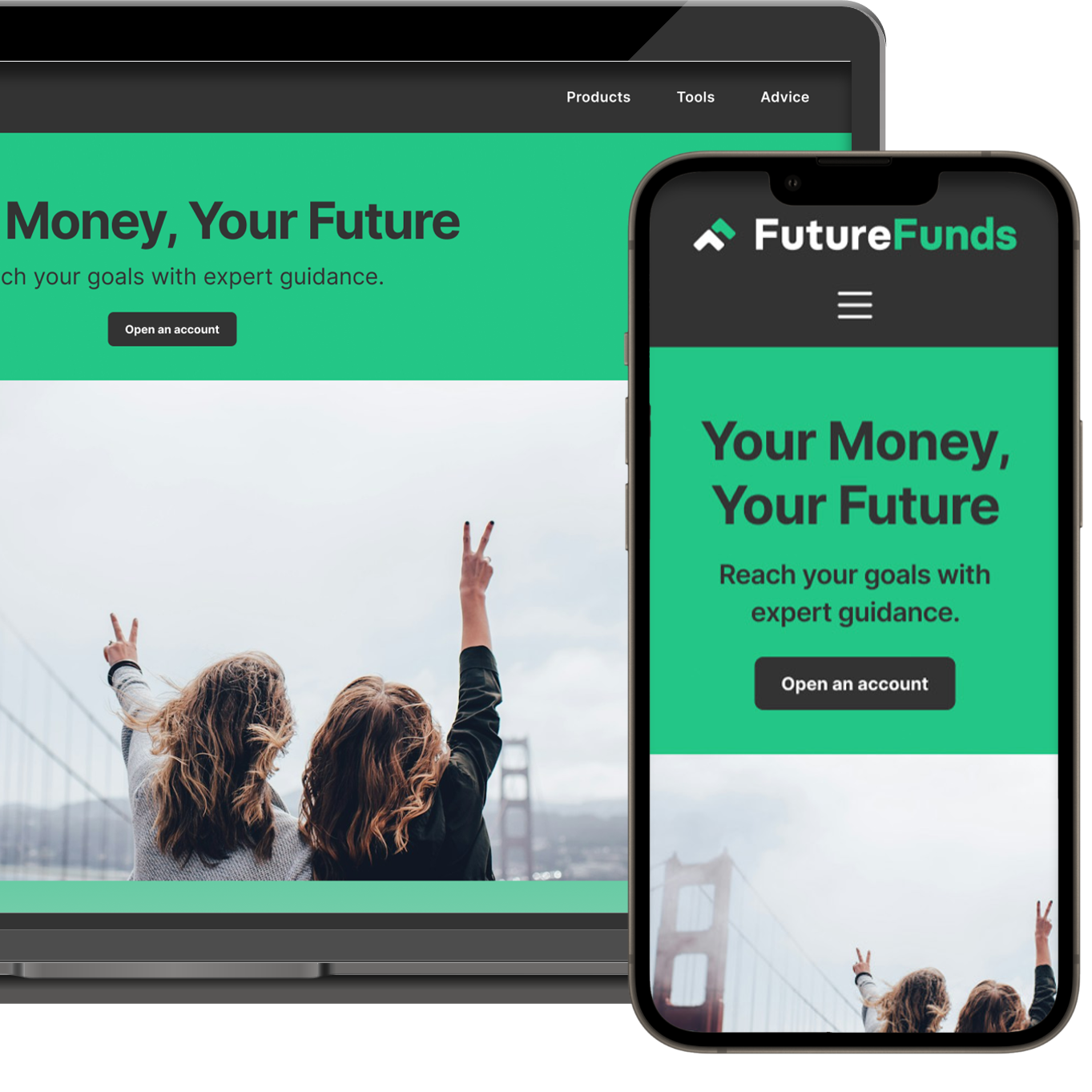
Adapting the design for mobile devices introduced very different constraints than desktop; ensuring design responsiveness for smaller screens meant adjustments needed to preserve clarity and usability while working with far less room.
Minimizing Content
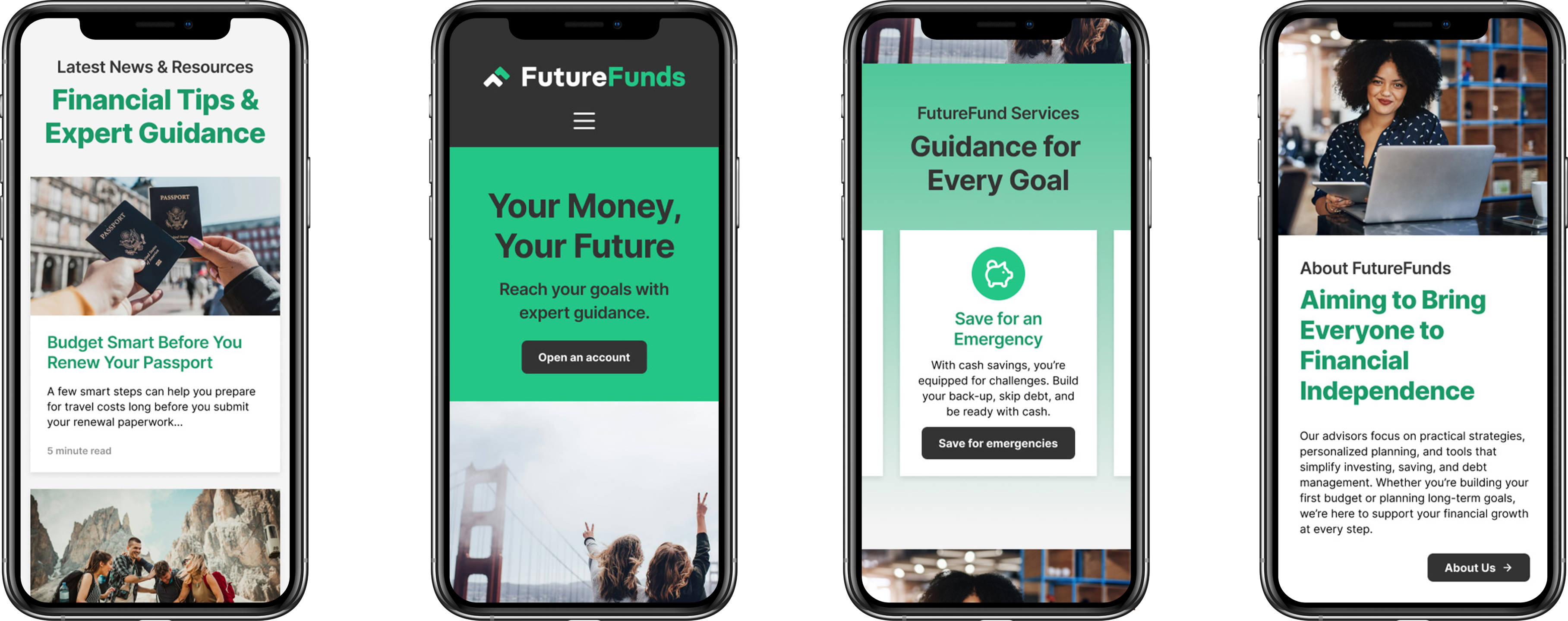
First, I prioritized content, focusing on what users needed most at each point. I minimized or limited content seen in each section of the mobile version, so the experience wouldn’t feel cluttered and overwhelming.
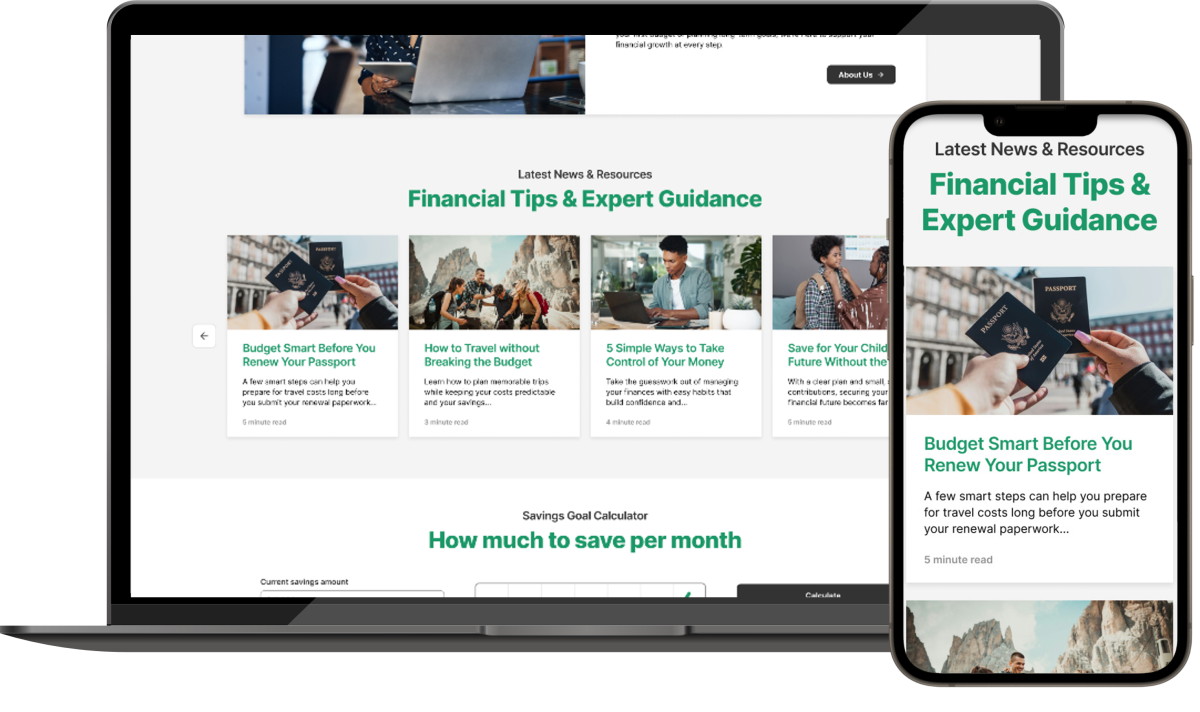
The blog section, for example, switches to a vertical layout on mobile, and limits the number of visible articles. Showing fewer content cards in this section helps reduce scroll fatigue while still signaling additional content is available elsewhere.




Click to view!
Simplified Navigation
Global navigation collapses to a hamburger menu on mobile so that the primary content remains visible while still keeping all major sections within reach.
Touch-based Gestures
Since mobile devices lean into touch gestures like tapping and swiping, the mobile version needed to consider for how people actually use their phones.
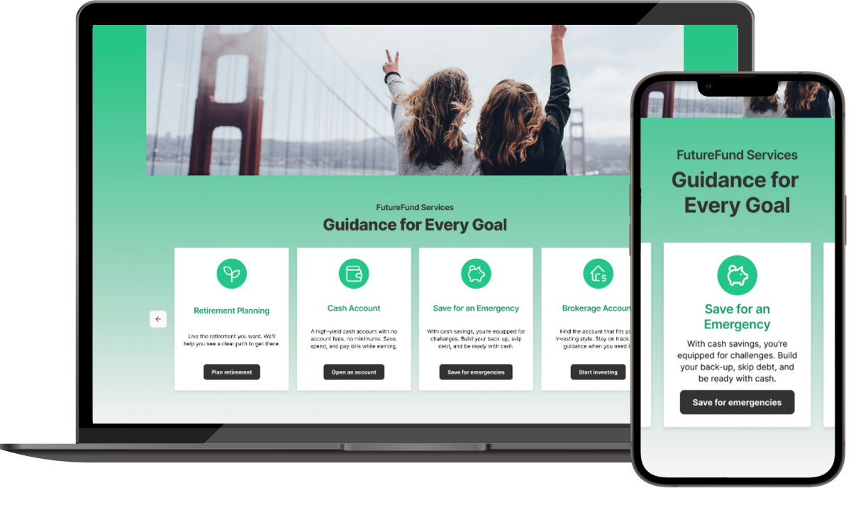
Elements like the services slider move away from arrow-based controls in favor of horizontal scrolling. Buttons, icons, and other touch targets were also enlarged and spaced further apart to make tapping them easier.
Solution
Final Design
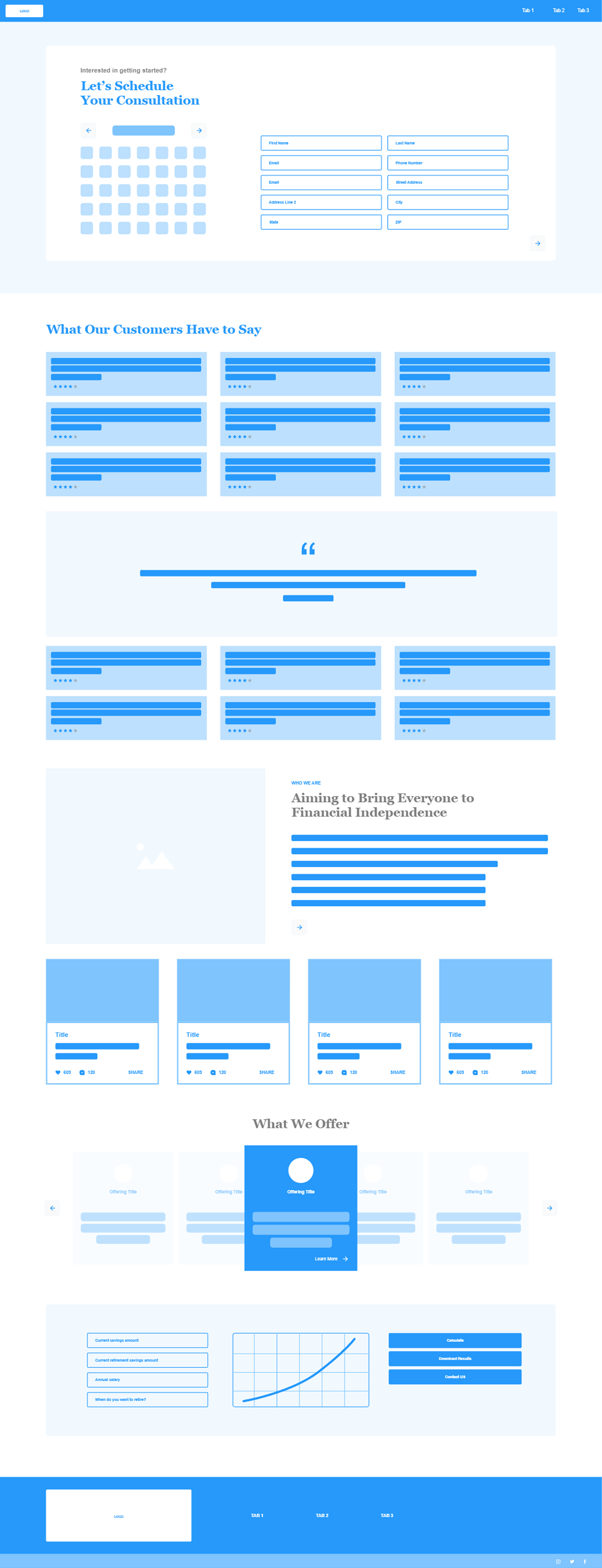
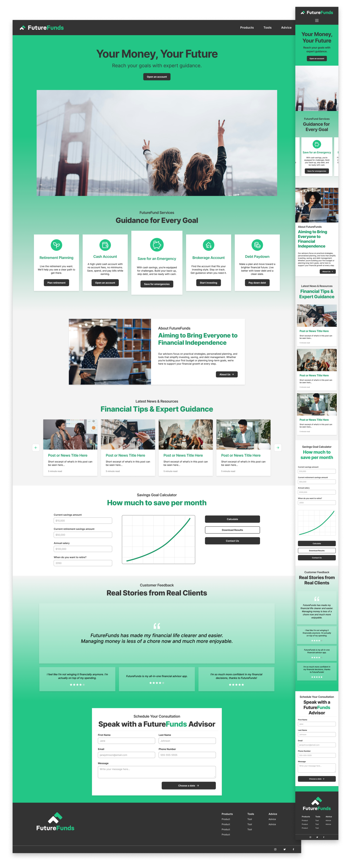
As the solution for this project, the final design is a considerable improvement to the initial wireframe we started with.
Before
Click to view!
After
Click to view!
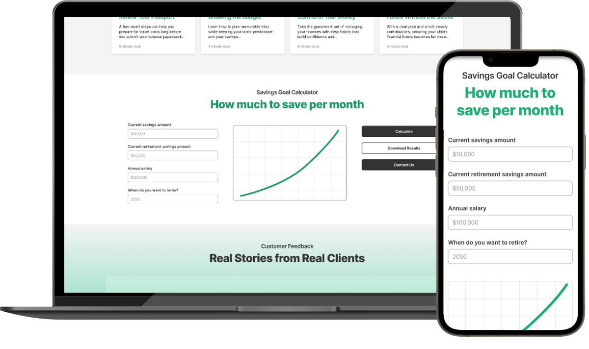
Page structure was rebuilt around a trust-first content sequence: value proposition, services, interactive calculator, social proof, and only then a prompt to schedule. This mirrors how a first-time visitor to a financial services site would naturally evaluate a company before committing to anything.
Mobile design and accessibility standards were treated as distinct constraints in the design process. Consistency and hierarchy were prioritized across breakpoints to build interface predictability.

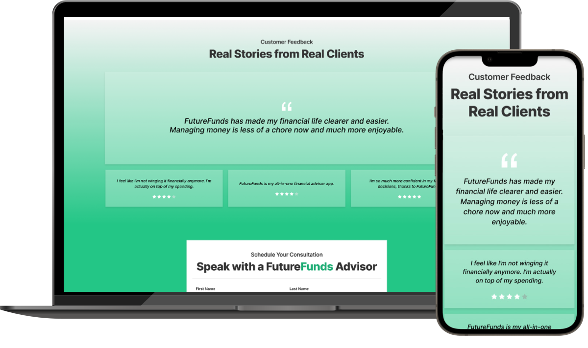
The Prototype
Checkout the mobile and desktop mockups from Figma below:
impact
What Happens Next
In addition to the high-fidelity mockup above, I developed a structured usability testing plan to establish a framework for validating design decisions against real user behavior. However, as a university project, we stopped here.
Testing & Iteration
If we had continued this project through to completion, I would have conducted a moderated test as planned with 6-10 participants and used the results to further iterate on the mockup design.
The findings from this test would have helped gauge whether the redesigned layout, hierarchy, and visual organization were working as intended: building trust, clarifying value, and guiding users toward meaningful next steps.
What I learned
This project helped me identify parts of the design and research processes I enjoy most. The top three lessons I’ll take with me into future projects, are:
the value of realistic placeholder content
As someone who values content-first design, designing around content that did not exist was a challenge. Hierarchy, pacing, and trust cues were easier to resolve after adding realistic placeholder images and copy, making design decisions clearer.
Mobile constraints force prioritization
Designing mobile-first can be incredibly useful, forcing you to prioritize what really matters and clarify content hierarchy before expanding to desktop. It’s much easier to scale up thoughtfully rather than scale down or simplify a dense layout.
Patterns in Competitive research
Competitive research was most valuable at identifying patterns across similar financial service-based websites. Digging into nuances helped me understand how other sites establish trust, manage disclosure, and guide users through conversion.